

Creating a Non-Profit Annual Report Which Influences People

There’s a number of reasons to create a non-profit annual report, whether it’s to generate positive PR, to demonstrate to donors and trustees how their money is being used, or to counteract negative press and misinformation.
It’s also a fantastic opportunity to influence people to take action and support your cause. A great annual report could be a platform to further growth – if it’s approached in the right way.
Before you begin, there are a few rhetorical and visual devices you should know about that could make the difference between an effective report and one that flops.
Less Is More
It can be tempting to report on all the great successes your organisation has had over the last year, but this can lead people to switch off and stop reading. Cut your report down to a few or even a single page rather than the traditional magazine-length document, and your audience will be much more excited to read through it.
Start by cherry-picking some of your best stats and stories. Remember, this is your opportunity to shout about your organisation’s best moments from the past year; you don’t need to write out an exhaustive laundry list of achievements.
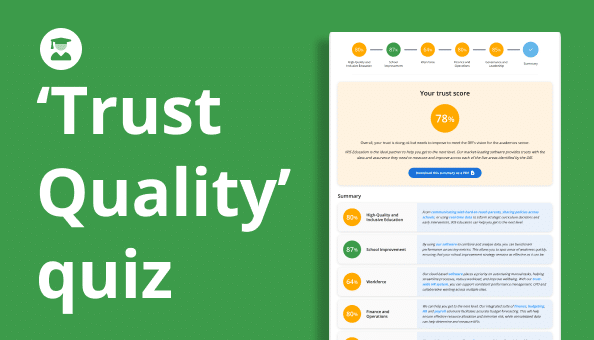
Also, the more precise the data the better. The freedom to precisely identify where a restricted fund has been spent will elevate your report. This data can take a lot of time to compile; however, using a unified ledger system, like the one found in IRIS Financials - charity accounting software, makes the turnaround far less painful.
Attention-Grabbing Imagery
The first page of your report is crucial. If it’s packed with text – for example, a letter from the director of your organisation – this could turn people away before they’ve even started. However, that’s not to say that a letter would be a bad idea further on in your report; just not on the cover.
Consider using a bright colour palette taken from your organisation’s logo and style guide. Infographics and pictographs are an easily digestible way to represent statistics. You can also use pull quotes for emphasis and to make important facts, figures and statements stand out.
People don’t want to trawl through an endless wall of text to get to the meat of your report. Having said that, try to keep it simple with a few strong points per page; if you do opt for an infographic, you don’t need to throw a million pictures in there to make your point.
The X, Y, Z Magic Formula
When in doubt, you can’t go wrong with the X, Y, Z formula. It’s a great way to present your most important statistics.
Start with how much funding you’ve raised (X), explain how many things this enabled you to buy/build/create/send (Y), and finish by making the statistic personal – how many people/animals/buildings this helped (Z).
For example, imagine a fictitious organisation called the Unicorn Foundation that has been established to help save the unicorn. They could report on their overall funding, the food they’ve been able to purchase with it, and how many unicorns they’ve been able to feed with it.
"Together, we have gathered £2,000 of funding – enough to purchase 10 tonnes of unicorn food. This has fed 200 hungry unicorns for a full year."
Depending on the accounting system you use, obtaining the financial element of this formula can involve some tricky investigation work – but once you have it, this data provides clarity that strengthens the supporting data.
This knits three statistics together to plot a cohesive journey for people’s donations. The X, Y, Z formula forces you to think like a storyteller.
Tell a Story
People are motivated by stories. Whether it’s an advertisement for cereal, a cleverly designed supermarket logo, or the annual report of a non-profit organisation, it’s the narrative behind it that inspires people to act.
This means that if you want to influence donors and compel them to act, you’ll need a captivating case study. Case studies make your report personal to your audience and showcase the individuals behind the statistics.
If you’re unsure where to start, focus on one or two people who have been profoundly impacted by your organisation. The X, Y, Z formula also applies here – tell people explicitly how and where their funding has helped these people.
This is a great opportunity to include a portrait or action shot of some of the people who have been affected by your organisation. Remember that people respond positively to human faces, and just by including pictures of real people in your reports you can lend credence to facts and figures. Even better, you could record a short video case study showcasing your organisation at work.
More than anything, people just want to see that their donations, past, present or future, are making an impact. Stories that focus on an individual’s journey and experiences are an excellent way to demonstrate how you spend your funding to achieve this.
Highlight Your Difficulties
It may seem counterintuitive, but people will also want to hear about any roadblocks you’ve come across. As you move through the report, present statistics that highlight any difficulties you’ve encountered and explain how you overcame them. This provides clarity and develops further trust in your brand.
For example, if your organisation has recently overcome inefficiencies by adopting new software, you could calculate the overall time savings you have made.
Thank Your Present and Future Donors
Thank everybody that contributed. While it’s nice to issue a blanket thank-you, you can also name top contributors and let them know that they’re appreciated.
This is also the ideal place to outline your plans for the immediate and distant future. What will you focus on in the next year, and how will people’s future donations benefit the organisation? Are there any salient points from the report that you’d be looking to build upon or improve?
This leads neatly into a call to action.
Call to Action
Here’s your chance to spur the reader on to further action. You’ve presented them with in-depth figures and stories that prove your organisation is making a real difference to people’s lives, and chances are, they’ll be willing to join you on your mission.
If you’re unsure, you can’t go wrong by asking for future donations. If you’ve outlined your plans for the future, people will want to donate to help make that happen.
Use Accurate Statistics and Financial Data
There’s a lot to bear in mind when creating a non-profit annual report. You don’t want to add to this complication with dubious stats.
You need absolute confidence in the statistics you present, as they’re crucial to how people will perceive your organisation. You’ll want to include financial statistics and personal stats that showcase your brand in plain English.
Organisations’ financial management software often locks them into reporting the same bland statistics, and it can be a struggle to find compelling data to publish. However, with IRIS Financials’ unlimited dimensions of analysis, it’s easy to pull accurate, relevant statistics from your database.
If you want to create effective annual reports that motivate people to act, contact us today to discover how unified ledger software could revolutionise your reporting.


